Top 4 Web Design Trends That Will Rule the Market In 2024

web design horley

This year is already ending; hence, a new year comes with new advancements, new technologies and new happenings. The field of website design and development is following the same. The experts seek new trends to rule the market in the upcoming year.

The website design of the year 2024 helps redefine the overall user experience and reshape how people interact.

The field of website designing is undergoing many transformative journeys that redefine user experience and push the boundaries. Almost all the companies that offer services on web design in Horley and other areas also focus on the latest trends.

Here, in this blog, you will learn about the latest trends that come into play in the upcoming year. You can explore their elements, redefining the future of website design.

Top Website Design Trends to Check

  1. The Combination Of Functionality And Aesthetics

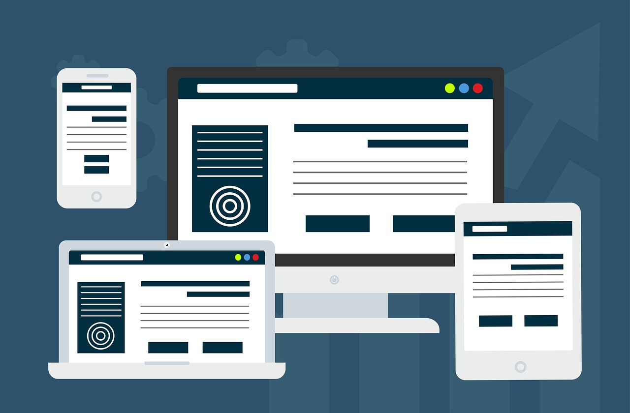
The future of website design is all about choosing a perfect balance between website design and functionality. As per the leading companies that offer services on Website design in Horley, the websites should be designed to indicate constant dynamic flow. Some major elements that need to be included here are user-centred design, responsive layouts, interactive elements and visual hierarchy.

  1. Minimalist Interface Design

The age-old norm, “less is more,” will become very important in 2024’s website design trends. Here, the minimalist interface design reflects the work’s simplicity, efficient functionality and clarity. By reducing clutter and unwanted elements from the website, you can have clear, uncluttered and aesthetically pleasing websites which are user-oriented, too. Minimalist design principles reflect on responsive layouts, which ensure that all the websites adapt seamlessly to various devices and screen sizes.

  1. A-Driven Personalisation

Do you know that AI-Driven personalisation can lead to the crafting of tailoured experiences? Yes, using various AI elements, you can attract more users to the website. Most of the tasks you can do, like machine learning, utilising AI tools, harnessing AI power, and bringing about dynamic user evolution.

  1. Use of Virtual Content

2024 is all about combining reality and the virtual world. Virtual content means including augmented reality AR and virtual reality elements. The designers should include elements like 3D models for virtual tours that offer users a lifelike experience.

These are some of the latest trends you can see in website design in the year 2024. If you want the best Web Design Services in Horley, you can get help from the experts from Media & More Ltd. We have a team of expert designers to help you design your website per your budget and requirements. Feel free to explore more from our website.

How AI is Changing the Scenario in the Field of Web Designing?

Web Design

The current age has created a scenario that balances automation and human force. AI, or artificial intelligence, which was the next big thing a few years back, has now become a solution provider for various tasks. After showing its prowess in different fields, it is slowly being developed for the assistance of web designers and developers.


The Importance of a Functional Website:


At a time that depends heavily on technology, designing a properly functional website is the need of the hour for businesses. It acts as an online inventory that introduces potential customers to the vital details of the business. However, to make it look good and highly functional, it is important to take the help of a professional web designer.


The Role of AI in Website Designing:


Instead of the traditional concept of web design, many designers are now taking the help of AI. You can find multiple tools supported by artificial intelligence that make web design in Surrey simple. The main benefits of using AI in web designing are discussed below.


  • Personalisation: AI can be your best option when giving customers a fully personalised experience. It has the ability to deliver relevant content to different website visitors. AI understands machine learning algorithms better. It helps it understand user preferences and behaviour properly. This later helps provide improved services. This includes product recommendations and targeted messaging.


  • Better Data Insight: AI Technology is also useful in collecting and analysing user data. This can be a game-changing benefit for business owners. With the help of the website, they would be able to read the preferences and expectations of the customers. This would help them optimise the website’s layout, content and other design elements.


  • Site Performance: While designing a website, a professional needs to ensure that it does not hamper its SEO properties. This can negatively affect the site’s performance and, eventually, the business. With the help of AI, one can optimise the website code. This can improve its loading speed. This helps in faster page loading speed, thereby improving user engagement and taking the website to the top of the search engine.


These are a few vital advantages that AI can provide in designing a website. The designers should keep a tab on the modern improvements for an improved web design experience. If you want modern web design assistance from a trusted source, contact Media & More Ltd. We are a well-known web design service in Surrey known for responsive web design services. For more information, you can visit our website today.

Top Three Signs Your E-commerce Site Needs Redesigning

responsive-website-design

The design of your e-commerce website can significantly influence your sales and customer experience. A website design should be user-friendly that is also modern and attractive. A website that has not been updated for a long time can lead to poor functionality. With an updated design, your advertising efforts will be successful.

But how can you understand when your website properly serves your clients or needs updating? There are a few aspects that you must notice to analyse your site, and it all comes down to how clients are now treating your site. This is called user experience, and it’s key for your website designer in Coulsdon to make it count when finding ways to increase your online sales. Here are the signs that your e-commerce site is in need of some web design.

When Your Website Is in Need of Some Design?


Your site is difficult to use

A website design’s most crucial advantage is its user experience. An e-commerce website should be user-friendly so customers can easily find what they need. They will leave your site immediately if they can’t find the product they want quickly. However, this can be fixed with an efficient website design. Consider your prospective clients and see whether they can find the needful quickly.

Your search engine rankings are subpar

When it comes to boosting search engine rankings, website design plays a critical role. For search results pages, Google doesn’t only verify the written content. UX plays a significant role in your site ranking as well. Also, your site needs the implementation of an effective SEO strategy. SEO raises your website’s visibility in search engine results pages (SERPs), boosting website traffic and sales.

Your site is extremely slow

The first problem with a slow website is that users may lose interest and leave it out of frustration. This implies that if the website is not speed-optimised, potential customers can leave. Furthermore, a lot of search engines penalise websites with sluggish load times by placing them lower on their search engine results pages (SERPs). This restricts access to potential clients and further lowers visibility. Your website redesign should focus on making it faster and more user-friendly for customers.


If you are searching for an experienced and competent ecommerce website designer in Coulsdon, look no further than Media & More Ltd. Our expert team of web designers can deliver a website that looks excellent, is user-friendly and can help you generate more sales. To know more, get in touch with us today.


Common Mistakes You Must Avoid When Designing a Website

website design services

Designing a website needs an individual to be creative. Understanding the project’s scope is important before you start working on a website or designing a new one. You can hire an expert for the best website design services. Here are some of the common mistakes in website design.

Avoid These Designing Mistakes To Develop a User-friendly Website

Overloading

Using various types of fonts, incompatible colour palettes, scattered images, and other elements can overload a website. Try to stick to a single style and avoid choosing more than two or three colours wherever possible. 

Poor Structure

Messy pages are one of the biggest mistakes when designing a site. This includes a curved layout, a jumble of blocks with content, inconvenient navigation, button inaccessibility, and other important elements. Hence, designing a site that makes its visitor understand the entire structure is vital. You can also create a map if a site is complicated. 

Pop-ups

Well-designed pop-ups can indeed benefit your business. But frequent pop-ups can irritate users. Avoid overlapping the content and use reasonable-sized banners. It will help users to gather the required information. 

Poor Quality Linking & Inappropriate Images

Links that are not clearly visible to the users can annoy them. Ensure using high-quality links and images on your site. Besides, also make sure that those links are relevant and do not confuse visitors or divert their focus. 

Infinite Page Scrolling

This can be ideal for engaging users to explore everything about a site in-depth. Scrolling is also ideal for mobile devices. But it also doesn’t always display accurate data. Hence, ensure to use the scroll while attaching materials to the top. It will give users enough information without downloading all the pages.

Slow Loading

This can have a negative impact on the visitors of a site. Problems while loading a page are the main reason many sites remain abandoned. You can optimise the image size to reduce download speed. Besides, web-based tools can also provide insight into your site and improve the download speed. 

Lack of Optimisation for Search Engines

Just completing a web-design course isn’t enough to create an impactful website. Ensure using unique texts on the site on all the pages. 

Media & More is a leading company providing quality services for website design in Horsham. Contact us today to learn more about our services. 


Why Maintaining Visual Hierarchy Is Important In Web Design?

website desgn

Visiting a website and not finding what you are looking at indicates a poor visual hierarchy. Positioning is important to boost your website performance. You can hire experts for impactful website design in Surrey. Here’sHere’s what you should know about the visual hierarchy.

Importance of Visual Hierarchy

To understand the significance of visual hierarchy, first, you should know what it is.

What is Visual Hierarchy?

It is the principle of arranging elements in the relevant order, considering their importance on a page. On average, a person will spend nearly 8 seconds to ascertain whether it’sit’s relevant. From menu and logo positioning to placing buttons and icons, everything must be arranged in a pleasing way to facilitate the audience.

What are the principles of Visual Hierarchy?

Seven principles of the visual hierarchy include:

  1. Position
  2. Size
  3. Colour
  4. Alignment
  5. Contrast
  6. Proximity
  7. Typography

Content must be easy to find and logically structured to provide a positive user experience. Let’sLet’s learn these principles in detail below.

  1. Positioning

Most humans generally read left to right and start from the top. Generally, the human eye follows two patterns to quickly absorb information, whether it’s a website, illustration or something else. These two usual paths are Z-shaped and F-shaped.

Z-Pattern: With this pattern, the user first scans horizontally throughout the page where there is vital information and then moves diagonally towards the lower section of the page.

F-Pattern: This pattern is typically applied for reading text on heavier pages. With the F-pattern, the user typically starts reading the headlines first and moves down the page’s left side looking for important headers, bullet points or numbers.

  1. Size

Size also plays another important role, representing a sense of hierarchy. It helps search sections and build an organisation within the image or text the user looks at. The best example is an offer or deal’s terms and conditions section. They are significantly small in size as companies don’t want to draw customers’ attention to them.

  1. Colour

We can assume the colours psychology in the visual hierarchy to encourage our users to act in a certain way. You can use visual hierarchy to stir up the action with:

Use contrasting colours for contrasting themes across the content.

Save the eye-catching colour from your brand’s palette for calls to action and buttons.

Keep important information in the same colour throughout the content.

  1. Contrast

This strategy is best seen in magazines. Use assets and colours contrasting to your brand to signpost essential information to users.

  1. Alignment

It’sIt’s essential to keep your content digestible. For example, Format important information with a central alignment rather than a left-handed one.

  1. Proximity

Using proximity and space is crucial in separating content or bringing it together, whether it’s a minimalist, single page or flat website design.

  1. Typography

The right pairing of typefaces can provide a website with its uniqueness.

Media & More provides the best services for web design in Surrey. Contact us today or check our website for more information.