Top 7 tips for creating the most successful website for your business

Website Design

Top 7 tips for creating the most successful website for your business

In this digital era, your business must have a website, but there are some critical aspects to it which should be considered while deciding on the site. The fundamental confusion occurs in grasping the fine lines between a great website and a successful website. Studies reveal that a visitor only spends an average of 7 seconds on 90% of the sites he/she visits. This anyway signifies that there are only a few precious seconds at your disposal to put up a complete image of your business in a convincing way to a potential customer. It seems to be a critical goal to be accomplished, but if you put an earnest effort to avail one of the best approaches in web design services, then it would be an easy affair.

Here are the 7 critical considerations to set up a benchmark website

Communicate your purpose strongly

You must be aware of your purpose well and must have a clear idea about how to communicate it at its best. Make the communication upfront, neutral, and transparent. The message should deliver your identity and your objective with an intense expression. It should be commanding yet persuasive so that the visitors have your status as the major takeaway. This signifies that even when they have left your site, your vision lingers in their mind. Hene, they come back to you with a requirement.

Make your site navigable

There are certain aspects you must consider to attribute your website with comfortable navigation property. Put the information in a structured way on the website to achieve this aspect. The items in the main menu should be organized in subpages. Set up a path you will like your visitors to take and use promo boxes to lead them to the path. Detect the contact details easily.

Enhance the quality of the content

The content should be of high quality. Now, what that signifies? It means that the content should be interesting to the users and they will love to go through it, and at the same time, it should be search engine friendly as well. There must be lots of images and videos accompanying the content. It is the usual practice of the user to scan the pages thoroughly and so the content must be easily scannable. This requires the titles to be clear and the sentences to be short with a few bullet points, and essential points to be highlighted with Bold and italics.

Website design for faster loading

As the site loads at a faster rate, then it just doesn’t improve user experience also reduces operating costs. So, a faster site will enhance your SEO rankings and will push the website higher in the search results displayed by Google.

Inclusion of a blog

Blogging has a tremendous impact on the popularity of your business website. It helps you to market your knowledge and skill for your service, product and the overall business. It drives traffic to your website as you use more keywords and related phrases to write exciting blogs on subjects that resonate with the target audience. A great blog enhances your page ranking as well.

Go for great website design

Never underestimate the capacity of excellent design to create the lasting fast impression for the potential customers. Using a clean design with the chosen colour palette, and beautiful fonts will reflect the image of your brand and business in a big way.

Mobile-friendly responsive design

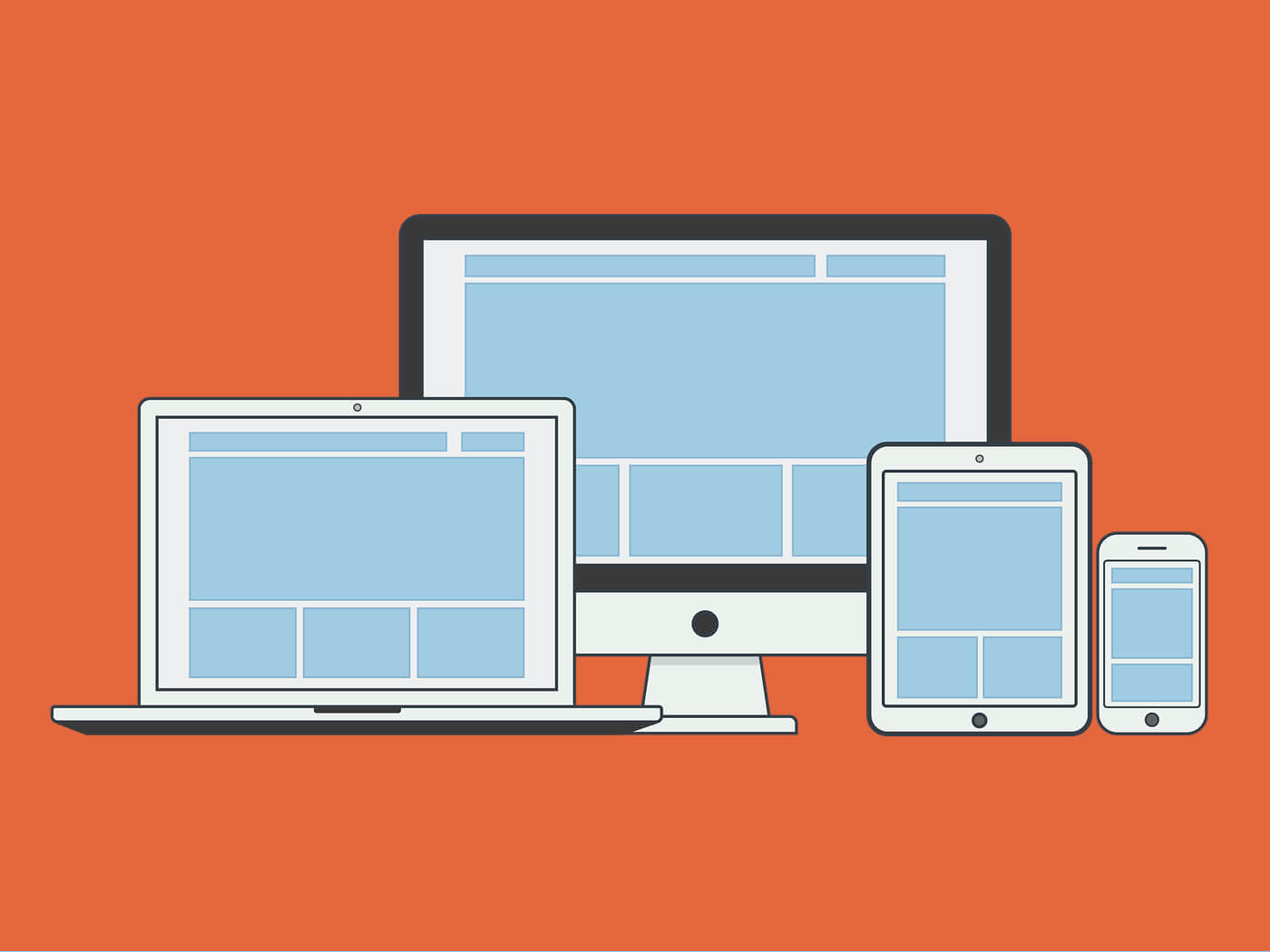
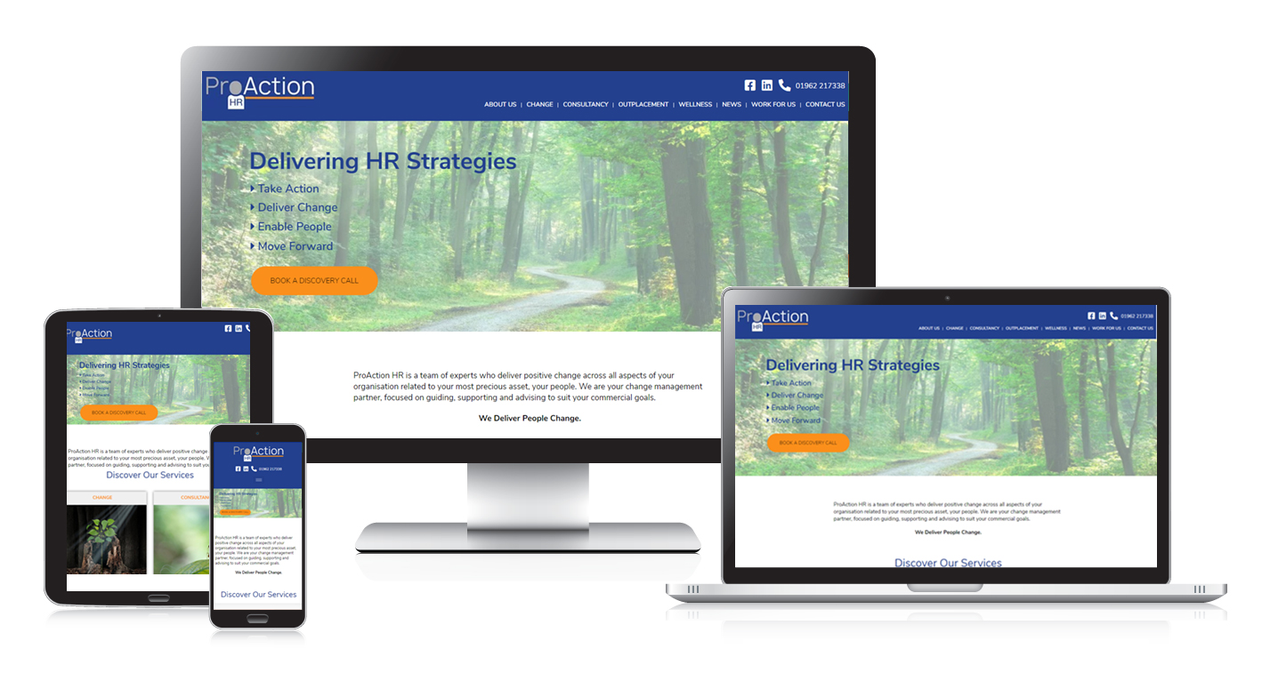
Nowadays, websites are viewed in several devices with different screen sizes. Hence, the design should be responsive and mobile-friendly. This signifies that the site automatically gets adjusted to different widths and sizes depending on the type of device. This indeed offers a great viewing experience.
If you are looking for the most effective business website, then try the web design services from Media and More. It will be an impressive experience, no doubt.

3 Ways how photoshop can be used during website designing

Website Design Services

3 Ways how photoshop can be used during website designing

8 Pages With Full Responsive and CMS Site

It has almost become a trend to use photoshop during website designing. There are even a few people who think that some part of the designing should be done in Photoshop while the rest can be done in the browser. This trend has become a topic of discussion in various Responsive Web Design forums.

It is not only about the benefits one can reap by using Photoshop during website designing but also the drawbacks of designing a site only in the browser. The most vital decision a designer has to make is to determine the various ways they can use Photoshop during site designing. Make sure you use it as a medium without taking it to the extreme.

Graphic Design

Want to use photoshop during website designing? few tips for you

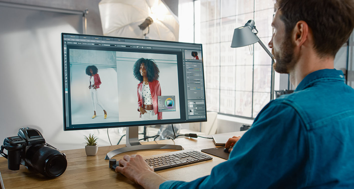
Combine different mediums in website designing

Developing the best design for your website becomes easy when you combine different media and mediums. Though professionals offering website design generally specialise in one specific tool, you can use elements from Illustrator. The medium you are starting with will not matter if you can use different mediums to develop the best design. Designers try to develop options quickly in the design phase, even if they are now aware of the full/precise details of the medium.

Know the default of the tools

Thinking out of the box is a must for designers if they want to create unique and visually compelling designs. Nowadays, the world of website designing is commercially driven. No wonder, designers prefer using pre-defined processes as it helps them to complete the project efficiently from start to finish. If you feel that you can design quickly using Photoshop, feel free to use it as your primary tool. Know the default of the tools so that the design can be functional in the world of indefinite browser options.

Explain the mockups

Once you have finalised a design for your client’s website, create a ‘mockup’ and show it to the client before you start building the site. It is the responsibility of the web designer to explain and demonstrate the mock-up properly to their clients so that they get an idea about what they can expect from the site. You can also get the necessary approval and avoid any confusion later. Let them know how much finalised the mockup is before seeking their approval. Even clients need to understand that a Photoshop-built design is not the final version.

Let start to follow above the tips of using Photoshop for designing a website. You can use the medium responsibly.

Improve user experience with 4 effective web designing tips

Improve user experience with 4 effective web designing tips

8 Pages With Full Responsive and CMS Site

Not everyone hiring a professional to design their website. They are not aware of the fact that customer retention becomes easier with good web design. If you want to ensure high-end user experience, approach experienced web designers instead of hiring an amateur. They know how to design a site which is easy to use and access. They review various web designing aspects before choosing the one which will suit your business needs. The right techniques should be used when optimising a site. It improves the functionality and attracts more visitors. Business owners willing to enhance user experience can follow a few tips and they can stay assured of seeing a steady increase in sales.

Few web designing tips to enhance user experience

Choose an elegant web designing

Online visitors take just a few seconds to decide whether they want to continue browsing a site they have opened or leave it. The easiest way to create the right impression in their mind is by choosing an elegant design. If the content they are reading and the images they are seeing are not appealing, they will leave the site immediately. You will know that the homepage is elegant if it has a fast loading time, offers easy navigation and follows a consistent colour scheme.

Create content wisely for web designing

The quality of the content on your site is as important as its design. A majority of the users just take a glance at the page instead of reading it word by word. The easiest way to improve customer experience is by creating scalable content which is easy to analyse. Try to divide the content into small paragraphs and use bullets, lists and headings when possible. A visual editor can also be installed if you are using WordPress to create a website and use it to format the content.

Optimise the loading time

You can stay assured that your webpage will offer good customer experience if you can optimise its loading time. A fast loading page with a good website design will keep your visitors engaged. You will be surprised to know that a majority of the internet users judge the credibility of a company after assessing the quality and structure of its website. If you don’t want to lose your visitors, design site which doesn’t take more than 4 seconds to load.

Include separate section for review and testimonial

Every experienced web designer is aware of the importance of including a review and testimonial section during website designing. When visitors know that other people have visited your site and are happy with the services you are providing, it encourages them to choose your service. The confidence of the customers increase and they can make better decisions.

These being said, it’s time you hire an experienced web designer who will follow the tips stated above and design a site which can improve user experience.

Hire a web designer if the current design is bad for your business

Hire a web designer if the current design is bad for your business

If you think that a good website design is the one which looks pretty, it’s high time you debunk the myth. Know the primary purpose for which you are designing the website. Check whether it is functional and solves the problem. The way how businesses are done nowadays has changed. And you need a website which can achieve modern business objectives. If you ever feel that the design of your current site is not benefitting your business, it’s time to craft a new website design in Horsham.

3 Signs that your current
website design is bad for your business

Homepage is not customised

If you have an online business but your site doesn’t have custom homepages, it is an indication sign that your website needs a new design. Just having a long welcome message is not sufficient. A good homepage is the one with some standard elements and widgets. Custom homepages have almost become a standard for online businesses. They are designed with just one primary goal which tells the story of your business.

Complete focus on pixel-perfection

Each pixel is given adequate attention by professionals so that the design gets a sharper look and not a muddy one. If you want to convert visitors to leads, don’t focus much on pixel-perfection. Web designers consider it to be a vital designing element. It can make a site look out of place, it is not the only thing to consider. Don’t waste your time on getting the perfect pixel. Rather, utilise your time to optimise the conversion process.

One page serving numerous goals

Even if your business has several goals, using just one page to tackle all of them is not a wise thing to do. If you are willing to drive more sales, acquire more followers on social media, get more subscribers, make people aware of your brand and get more shares and comments, make sure you focus only on one thing when designing a page. Designing a multi-purpose page is not only a challenge but will also confuse your online visitors.

Since you are now aware of the common signs indicating that your current website design is bad for your business, hire an experienced web designer before it’s too late.

4 Website design tips you should definitely try this year

Getting A New Website Know The 5 Elements Of Modern Website Design

4 Website design tips you should definitely try this year

8 Pages With Full Responsive and CMS Site

The importance of a good website design can never be neglected as it impacts how your online visitors perceive your brand. It is a vital part of almost every online marketing strategy. It takes just a few seconds for your audience to judge your business. This is why the focus of every business owner is always on crafting an appealing and functional design for their website. Even if you have a very creative mind, coming up with unique design ideas can be a bit frustrating at times. The best you can do is to start looking for an experienced web designer. Not only are they aware of the latest website designs but will also let you choose one which suits your business needs.

Few tips to improve your website design in Surrey instantly

Focus on the structure

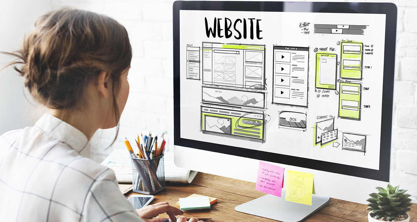
Every experienced professional offering website design in Surrey knows the importance of the website’s structure. It should be your primary focus if you want to ease the designing process. It is advisable to opt for a different medium rather than your computer. You don’t have to focus on the colour and other details of the design if you are sketching the design on the paper using a single pen. You can also use a post-it note to draw the website.

Make a plan

One of the primary benefits of creating a step-by-step plan is that you will get ample opportunities to put some creative touches. Understand the goals of your site and what you are trying to accomplish using it. A structure has to be created to guide your buyers along the way. Since you have to stay consistent during the designing process, create a suitable style guide. The style you are opting for should promote uniformity. The colours, fonts and design elements used should be well-defined.

Know the web standards

Even if you are very creative, make sure you follow the web standards when designing a site. You need to set some boundaries yourself and follow those. Make sure you don’t break rules which can confuse the designers and turn them off. You can reap all the benefits offered by a good website design if it conforms to all the prototypical standards. If you are not aware of the established rules, get in touch with an experienced web designer and they will help you stick to those.

Use your mobile

Since a majority of the people nowadays prefer surfing the web using their tablets and phones, first test the design on your mobile instead of your computer. A new mobile-first index has been recently rolled out by Google. Every website will be first judged by the search engine on their mobile presence. You have to treat mobile users as your primary customers; otherwise it will have a negative impact on your search rankings.

Time to follow the tips stated above and improving your website design instantly will become easier.

4 Ways the best web designer can reduce website bounce rates

Graphic Designers For Company Branding Reigate

4 Ways the best web designer can reduce website bounce rates

8 Pages With Full Responsive and CMS Site

Have you noticed website visitors leaving your site without even engaging? Are you struggling to convert visitors into customers in spite of getting consistent website traffic? Well, maybe the problem is your bounce rate. Wondering how to improve bounce rate and maximise conversions? Hiring an experienced web designer for lowering bounce rates can be the key to increase your conversion rate.

Bounce rate is the percentage of all users who visit and exit a webpage, without clicking other pages on your site. High bounce rates indicate that you don’t have a well-organised, enticing landing page. From obsolete aesthetics and confusing site layouts to slow load times, there’re numerous reasons why visitors leave your site instantly, Poor bounce rates.

Check out the handy guide below to learn more.

Ways leading web designer can improve your website’s bounce rates

Identify the bouncers

Tools like Google Analytics provide you with a thorough analysis of your website visitors. Specialists use this information to lower your bounce rate. For example, the analytics might indicate that most of the bouncers use Firefox. And, running your site in Firefox might help you discover that your page wasn’t able to render in the browser. Owing to such technical issues, the bounce rate might be high.

Reduce your site’s load time

No one likes to wait. And, there’s no one more impatient than the average internet user who needs information immediately at his/her fingertips. The longer your page takes to load, the more will you test the patience of visitors. And, with the easy availability of competitor websites, visitors have no reason to wait for your site to load.
Specialists will optimise your images as well as code for the web to reduce your site’s load time. Also, they will get rid of unnecessary heavy plug-ins, scripts and widgets.

Make your webpages responsive

Just like the browser issue, another technical problem which may lead to high bounce rates is an unresponsive webpage. For instance, your webpage looks good on a 1024×768 display of a desktop computer, but goes haywire on mobile devices. If analytics prove that a major chunk of your bouncers were viewing your page on mobile devices, consider testing your website. Opt for a responsive website design in Horsham to ensure your site is adaptive and robust across all platforms.

Interlink, recommend and relate

Is your site built around posts? A great way to ensure users spend more time on your site is designing elements which point to related content. For instance, you have a webpage which contains articles on plumbers. You need to ensure that there are links to posts about the best plumber in ‘related posts’ section. Also, you can include some hyperlinks regarding recommendations for suggested reading.

So what are you still thinking? Quickly find a skilled website designer and start benefitting from professional web design services. Time to improve your bounce rate!

How to make a stellar first impression with great web design?

Website Design Services

How to make a stellar first impression with great web design?

8 Pages With Full Responsive and CMS Site

50 milliseconds! Do you know that’s all it takes for a user to decide whether to stay or leave your website? Well, as per a recent study, it just takes a few seconds for users to make an opinion about a site. Wondering about how to ensure your site makes a good first impression in such a short period? Opting for professional web design in Surrey is all you need to do.

Studies have revealed that it’s the general look and feel of a site which influences the user’s first impression of what the website represents. Small font size, boring design, use of wrong colour, slow loading of images and too many pop-up advertisements are some of the reasons why users doubt the credibility of a site and leave it entirely. On the other hand, sites which have great design are visually appealing and leave positive impressions on the visitors.

Here’s how you can make your site look aesthetically pleasing with great web design.

Stunning web design in surrey: ways to make long-lasting impressions

Easy navigation

Usability is one vital aspect which can make all the difference to the impression your site makes to its visitors. Users are more likely to stay on sites with easy, fast navigation since they can promptly get the vital information they need. All you need to do is abide by the “3-click rule” where it shouldn’t take more than 3 clicks for the user to access the information.

Mobile compatibility

Website responsiveness has become very essential since most users prefer using their mobile devices over desktops to visit websites. A thoughtfully designed website retains the layout and formatting of the necessary elements regardless of the device’s screen size which they are using for viewing the site. So, opting for responsive website design in Surrey is important for every business.

Use of white space

Are you aware of the fact that putting up too much information on your site can distract visitors from the actual purpose of the site? Ensure you make it clean and simple by removing any information or content which isn’t essential. It is always advisable to prevent clutter by strategically using white space which is the intentionally left blank space in the page.

Bright colours

Using colours is a vital component of every site which is used for pulling traffic and converting them into sales. You have to make sure they use of colours is done by keeping in mind what the target audience wants and what they wish to read through. Using colours is needed for creating a welcoming impression.

More videos and images

Aesthetically appealing videos and images are a great way to attract users to stay on your site. Through info videos and infographics, consider minimising the use for additional text in your site. A site with less text and more images and videos is more prone to attract potential customers in comparison to sites which have too much text.

Time to make the 50 milliseconds count!

Factors on which the cost of web design in Horsham depends

Responsive Web Design Reigate

Factors on which the cost of web design in Horsham depends

8 Pages With Full Responsive and CMS Site

A primary benefit of getting your business website designed by professionals is that you can create the right first impression on your potential clients. Though you can try a DIY and design it yourself just to save a few bucks, it will look unprofessional and less credible. A well-designed website helps in boosting revenue by attracting visitors. It even becomes easier to add future website functionality.

Though a professional web design has so much to offer, there are still a few business owners who have not approached a web design company yet. This is primarily because they think that getting the website designed by professionals will punch a hole in their pocket. This is nothing more than a myth. How much you have to pay for website design services is dependent on various factors.

3 Factors which impact web design cost in Horsham

Components you need

Though there are numerous professionals offering website design in Horsham, make sure you choose one after considering their skill level. Don’t hire one offering their services at the cheapest price just to save a few bucks if you don’t want an unclear processor, faulty end product or inconsistent follow-through. Similarly, hiring one quoting the highest price is not an assurance that you will be getting the best services. The best you can do is to look for one who is experienced and possess the necessary skill level. They should be capable of providing you with comfortable user experience.

Skill level of the designer

Though there are numerous professionals offering website design in Horsham, make sure you choose one after considering their skill level. Don’t hire one offering their services at the cheapest price just to save a few bucks if you don’t want an unclear processor, faulty end product or inconsistent follow-through. Similarly, hiring one quoting the highest price is not an assurance that you will be getting the best services. The best you can do is to look for one who is experienced and possess the necessary skill level. They should be capable of providing you with comfortable user experience.

How organised you are

The cost of web design in Horsham is largely dependent on how clear your idea about the web design is. The designer might ask for a higher price if they feel that you are not organised as a client or you can’t provide complete information about the project you want them to handle. They will have to spend more time to understand your project and the final completion date might also get delayed. If you want them to quote the right price, make sure you collect all the project information and represent them in an easy-to-read document. This will make it easier for the professional to face the designing challenges.

Since you are now aware of the various factors on which the cost of web designing depends, it’s time you start looking for the right professional offering the service.

5 Typography tips in web design for better readability and viewership

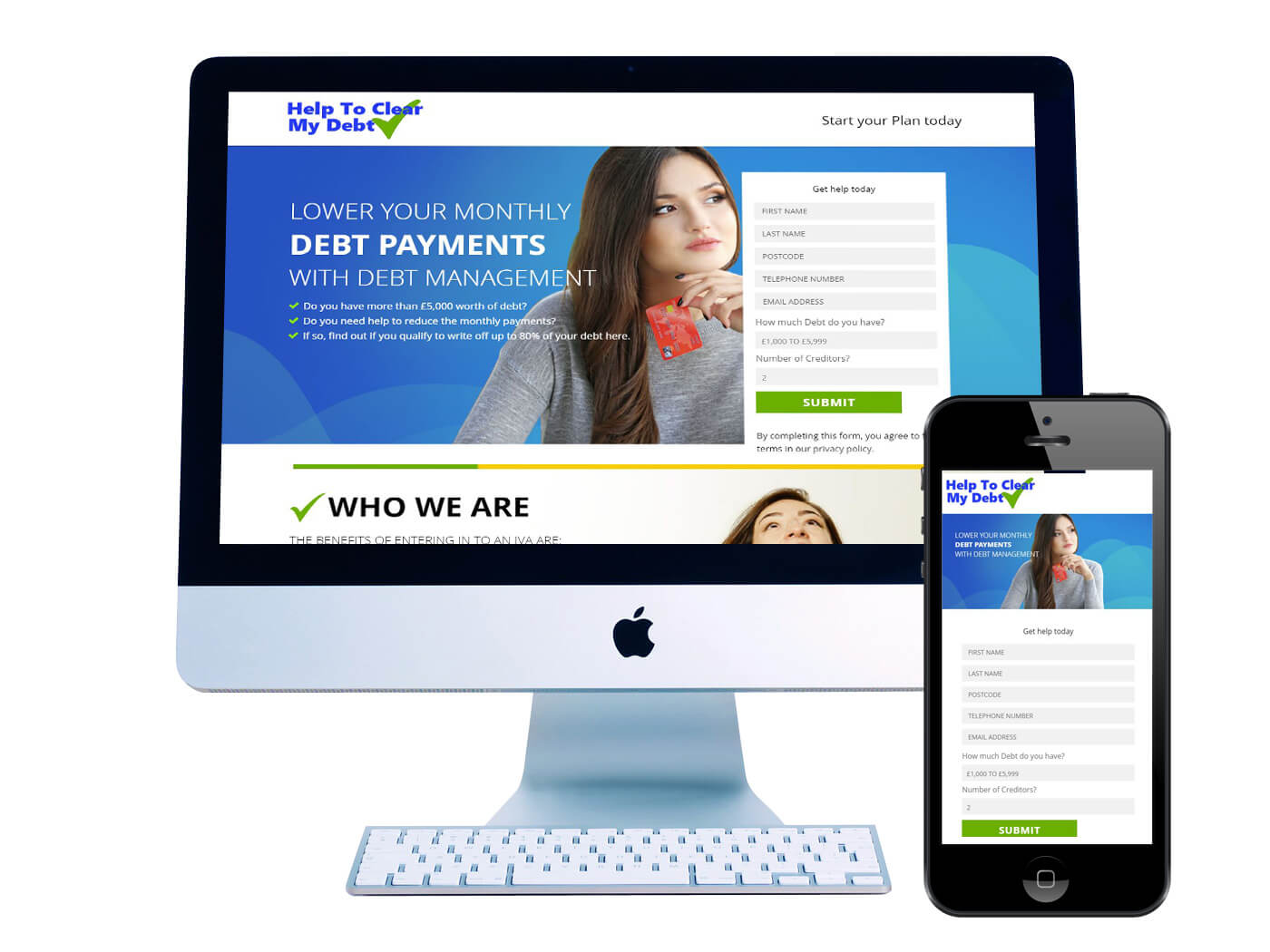
Help Clear My Debt - Website Design Dorking

5 Typography tips in web design for better readability and viewership

8 Pages With Full Responsive and CMS Site

Communications play quite a vital role in web designing. It is indeed very essential to establish a transparent communication between website and user. What it does is it allows users to accomplish their respective targets. As we talk about communication for web design in Surrey we generally mean text. To be honest typography plays a pivotal role in this innovative process.

95% information is in written formats

As per as latest statistics are concerned more than 95% information on web portal are specified in form of written language. Seamless typography allows viewers to read effortlessly. Poor typography will never have tenacity to attract and appeal to viewers.

Number of fonts used should be minimal

If you are using more than 3 different font’s website looks cluttered and professional touch diminishes. Do not forget that maximum type size and style at once can lead to destruction of a layout. You need to limit number of fonts to minimal and stick same through the entire website.

If you are using more than one font, you need to ensure that font families will complement each other based on width of character. For instance conglomeration of Georgia and Verdana always share same valuations.

It in turn creates a cordial pairing. On the contrary Baskerville and impact can cast a spell of negativity. It is because heaviness of “impact” overshadows sheriff counterpart.

Try and use standard fonts

Google web fonts and TypeKit are for font embedding services. There are quite a lot of interesting fonts that allow a fresh look at your design. They are quite easy to use. It is better to use fonts like open sans.

What you can do is generate codes and paste respective HTML documents. But let us concisely explain you that this particular approach has a definitive problem. Users can be at their zone of comfort with standard fonts. A standard font allows one to read in a much rapid manner.

Line and length needs to be limited

While crafting for a professional website design in Surrey one needs to follow proven protocols for creating seamless designs. If you are using right amount of characters on each of the lines readability increases. A professional design should dictate terms of determining width of the text. It is legality and needs to be followed with perfection.

For mobile 30-40 characters in a line can be implemented. In web designing, one can achieve an optimal number of characters per line. It limits width of particular text block by making use of pixels.

A typeface that works well in varied sizes is to be chosen

Do not forget that users will access site from numerous devices and screen sizes and resolutions. Maximum of the user interface requires text elements of varied sizes. It is a task of importance to choose a typeface that has the tenacity to work transparently. It works in numerous sizes and weights to ensure readability and usability in varied size.

Undoubtedly typography can be defined as a big deal. Good typography allows a website to look good and fresh. Chromatic aspect is not the result of a specific website. Typography in good websites are always business-driven and should be readable.

3 Fonts to avoid while carrying out professional web designing

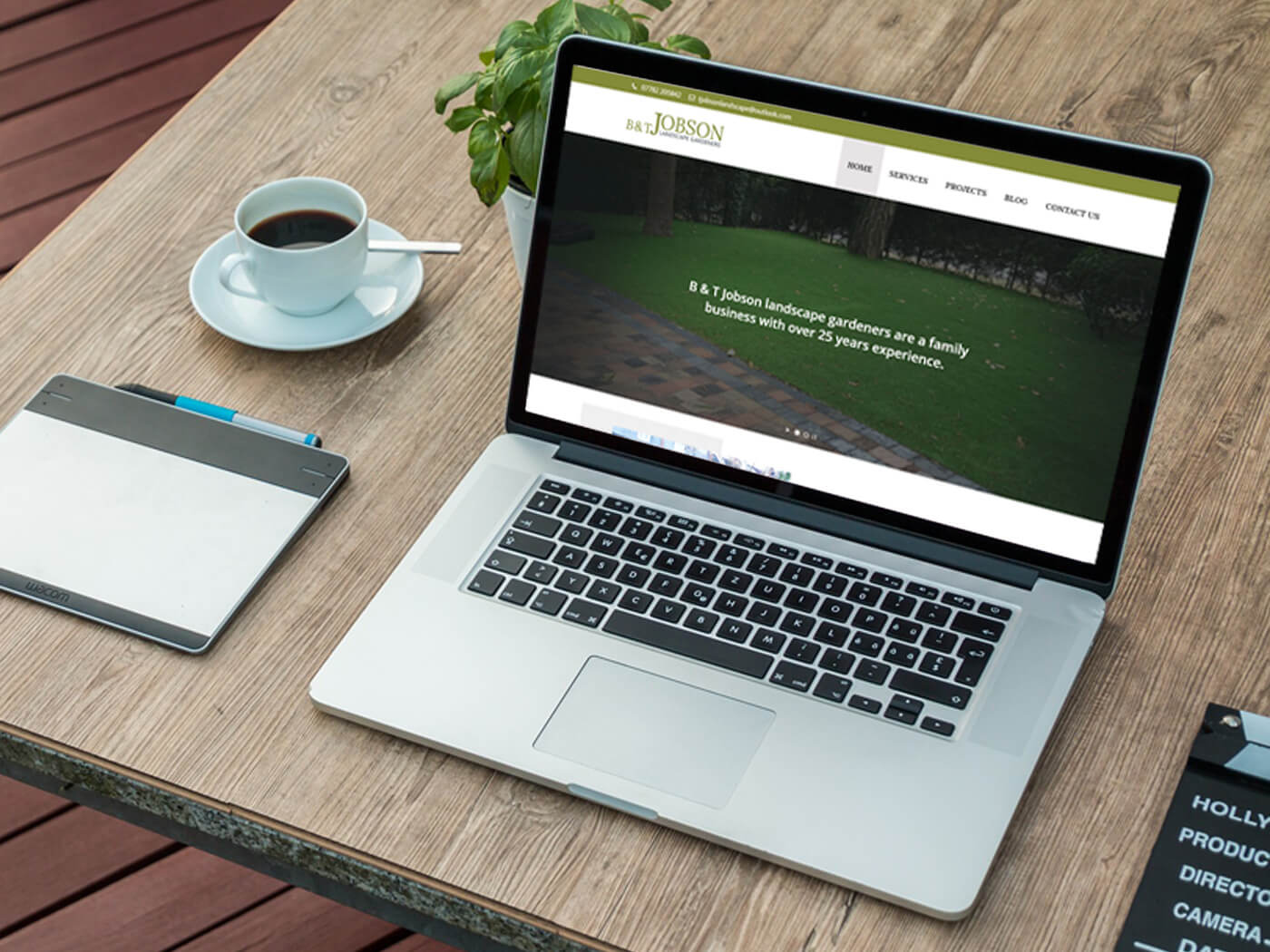
B & T Jobson - Website Design Wallington

3 Fonts to avoid while carrying out professional web designing

8 Pages With Full Responsive and CMS Site

A website is very similar to that of a resume. It is intended to reflect not only your creativity but also your personality as a whole. Colour schemes along with crisp images and user interface designs are essential components for creation of successful web designing in Horsham.

All these choices assimilate to let a visitor know how serious and efficient you are from a commercial view point. Poor and frail Web Designing with detestable fonts certainly create a negative impact on your business.

Web Design

Fonts are essential for successful web designing

Fonts have tenacity to perform a greater role in a respective design. You need have an idea about fonts you are about to use and ones you are about to abolish. Usages of fonts are indeed a great advantage, either in case of typography or in case of web page design.

Improper fonts fail to attract customers

Some designs turn out to be horrendous because designers have failed to use proper fonts. An improper font fails to create a lasting impact and it turns out to be a futile attempt to lure customers. In this particular write up to let us discuss in brief which fonts a professional designer needs to avoid.

Cosmic Sans MS

It is one of the basic window fonts that are installed in your computer. A pivotal reason for excluding this font is it looks very childish. At the same time, formality in this font is quite less.

If you are running a website for kids or designing a birthday invitation, you can make use of this font. It is being advised not to use it for swimming pool rule signboards along with grave epitaphs, hospitals.

Professionals carrying out Website design in Horsham believe that one should even avoid it while designing government job applications and on books. You can make use of Cosmic Sans MS when the audience is below 6 years old.

Curlz MT

This particular font lacks a formal approach along with authority. You cannot use it on a coat and tie event and on warning signs as it signals out to be like a joke for readers. It does have legibility issues also. Just imagine writing a book with this font. Individuals who are willing to read your book might prank jokes on you after seeing the font. Impression of this font is nothing but negative.

Arial

Arial font seems to be plain and ugly. Quirks added to avoid licensing made font unobtrusive and unattractive. In the past individuals were in favour of using Arial as it was readily available in operating system. With passage of time Arial font was applied everywhere. Be it in banners or advertisement hoardings and even on Television. This made designers sick and tired. It turned out to be boredom and claustrophobic for them.

To be honest there are quite a few fonts like Times New Roman along with Vivaldi, Bradel Hand ITC and quite a few more which needs to be avoided. So get in touch with us https://mediaandmore.co.uk/contact/ if you are want to build a website by avoiding the discussed issue.