The Role of Colours in Web Design: How to Make Your Website More Appealing

web design horley

The Role of Colours in Web Design: How to Make Your Website More Appealing

8 Pages With Full Responsive and CMS Site

Colour plays a pivotal role in web design, as it is integral to how people interact with websites. Colour not only helps create a visual aesthetic but also serves as a way to provide information, guide the eye and evoke emotions from the user. It can influence mood, create a sense of harmony or even provide clarity and purpose on a website.

Therefore, the use of colour must be considered carefully when designing websites to ensure that the best possible user experience is achieved.

Create the Focal Point for the Users

One way to effectively use colours is to create a focal point for users on a website. Primary colours such as red, yellow and blue are often used to draw attention to certain important elements within a page. In contrast, other secondary or tertiary colours will be used to complement these elements.

With a strategic selection of different hues and shades, designers can create certain visual effects, such as contrast or depth, which help guide visitors around the page and encourage them to take action.

Convey Brand Identity in Style

Colours are also important when conveying brand identity through website design. Companies often use their own brand colours throughout their site to maintain consistency across various pages and reinforce the brand’s message.
For example, McDonald’s uses its iconic golden arches throughout its website, while Apple adopts its signature black and white logo designs, which have become synonymous with its products.

Affect User Behaviour

Colours can also affect user behaviour when browsing websites too. Studies have shown that warmer tones (such as reds and oranges) raise customer excitement levels more than cooler ones (such as blues). This means that designers should consider what type of emotion they want users to feel when visiting their site—whether it’s calming, inviting or energising—and then choose the appropriate colour palette accordingly.

Similarly, bright saturated colours tend to increase engagement levels more than muted tones; therefore, if higher participation rates are desired, then brighter colour schemes may be employed instead.

Follow the WCAG 2 AA Guidelines

Finally, colour accessibility should always be taken into consideration during web design projects – particularly given recent changes in regulations such as WCAG 2 AA guidelines regarding web accessibility for disabled users. Creating template designs with high contrast ratios between text and background colours is essential for improved legibility for those with impaired vision or colour blindness.

At Media & More, we keep all these factors in mind while selecting the colour pallet for a website design project. Please get in touch with our experts to know in detail about our process and techniques.

Web Design Practices For Smart Navigation

A website with functional and smart navigation always makes visitors happy. You should create an organised and efficient navigation bar that can direct your viewers to the right way as per their requirements. They would love to explore more about your products or services while visiting your website. A functional navigation bar will make their job easy and fast. The navigation bar must have accurate and clear headings that can state information directly. You can also add subcategories under one navigation bar to make browsing easier for your viewers.

Most Effective Web Design Practices: Features Your Visitors Cannot Ignore

Web Design Practices

Most Effective Web Design Practices: Features Your Visitors Cannot Ignore

8 Pages With Full Responsive and CMS Site

A good website will help your business to stay in the competition for a more extended period. Nonetheless, creating a website that will help you attract traffic and offer a great conversion rate is not easy. There are lots of web design practices that determine the success of a website.

As a business owner, you should know the best web design practice to enjoy the desired ROI. You need to focus on features that will not make your customers confused and, at the same time, will help you to achieve your goals.

Best Web Design Practices

Web Design

Strong Branding

From the logo of your company to the image you use on your website, every single segment should be designed and developed as a part of your business branding. Your website must reflect the type of product or service you offer to your customers. For a company providing minimalist and smart products, the logo, image or headline of the website should be sleek, elegant and practical.

Web Design Practices For Effective CTA

Your website mainly aims to attract viewers, give them information about your products or services, and convert a casual viewer into a strong customer. The role of an effective and robust CTA or Call to Action button is imperative in motivating your viewers to perform an action to go the next levels one after another. This CTA must be positioned in a place that can be easily visible, clear and effective. The objective is to entice your audiences to perform a specific action (Call, send an email or buy products) to increase the conversion rate. The CTA buttons must look unique, alluring and intriguing so that buyers can easily notice and press them.

Fast Loading of Pages

Websites with slow loading time can ruin your online reputation. Visitors feel disgusted to stay on a site that takes too much time to load. To prevent the bounce rate of your website, you need to improve the loading time of your website pages and ensure that your viewers can enjoy a fast service. Use necessary plugins, smaller images, optimise your content – these are few tricks to increase the loading speed of your website. If you already have a website that has a slow loading speed, you can contact web design experts. They will add new features and rectify the existing ones to change the situation.

White Space

Our mind absorbs visual content more rapidly than what it hears. Both written and graphics or images can be absorbed by our mind, which sometimes makes it confused. The presence of too much content on a website can make the page look crowded and confusing. To avoid this issue, you must have adequate white space on your web pages. This white space might refresh your mind and eyes. An experienced and knowledgeable web designer will use this white space carefully and effectively.

Web Design Practices For Smart Navigation

A website with functional and smart navigation always makes visitors happy. You should create an organised and efficient navigation bar that can direct your viewers to the right way as per their requirements. They would love to explore more about your products or services while visiting your website. A functional navigation bar will make their job easy and fast. The navigation bar must have accurate and clear headings that can state information directly. You can also add subcategories under one navigation bar to make browsing easier for your viewers.
Responsive and SEO-Friendly

Nowadays, no one can imagine a website without these two features. A responsive or mobile-friendly website can attract 50% more traffic and earn at least 70% more ROI than a traditional one. On the other hand, being SEO-friendly means you can obtain a higher ranking on SERP, which will make your online presence more potent than ever. Web designers always try to build SEO-friendly responsive websites that are highly profitable for your business.

Media & More offers smart and effective web design solutions in Redhill to match your business needs. Please get in touch with our experts at 01737 400061 for more information.

Design A Professional Website In 4 Easy Steps

logo maker Banstead

Design A Professional Website In 4 Easy Steps

8 Pages With Full Responsive and CMS Site

If you are one of the business owners who think that the most vital part of a website is the navigation, it’s high time you debunk the myth. Numerous other features deserve equal importance during website designing. A new professional website is very beneficial for every business as it helps generate new businesses.

If you want to design a professional site, it’s time you start looking for an experienced website designer in your city. They follow all the rules and regulations when designing it, like placing all the vital information about the company in the upper left-hand corner after considering the reading pattern of the users. Your website designer can share a few tips if you want to create a professional web design for your brand.

Few Vital Steps To Follow When Designing A Professional Website

Pay More Importance To Mobile Strategy

Every experienced website designer in Banstead considers the number of visitors using mobile devices to browse through your site before they start designing it. They might even recommend you create a separate mobile version site if most users rely on mobile devices.

Set Your Goals Smartly

If you want to set some smart goals instead of unrealistic ones, ensure they are measurable. Few of the common goals you can focus on are generating more leads, increasing sales, increasing conversion rates, and reducing overheads. If you don’t know the business goals your website can help you achieve, take with your website designer.

Try Open Source Tools

Though there are a few advantages of using a proprietary CMS (content management software), you might end-up paying high license fees to the company. Website designers prefer going the stylish way. They try open-source systems which any trained developer can easily access, like Magento or WordPress.

Add New Content

Instead of copying content from your competitors, develop new and informative content that can easily blend with the web design. Gather as much content as possible before you start implementing the design. The quality of the content you are adding will impact the website’s performance.

These being said, it’s time you follow the easy steps stated above and get in touch with the experienced website designers at Media & More.

Tips To Choose The Right Colour When Making A Business Logo

logo maker Banstead

Tips To Choose The Right Colour When Making A Business Logo

8 Pages With Full Responsive and CMS Site

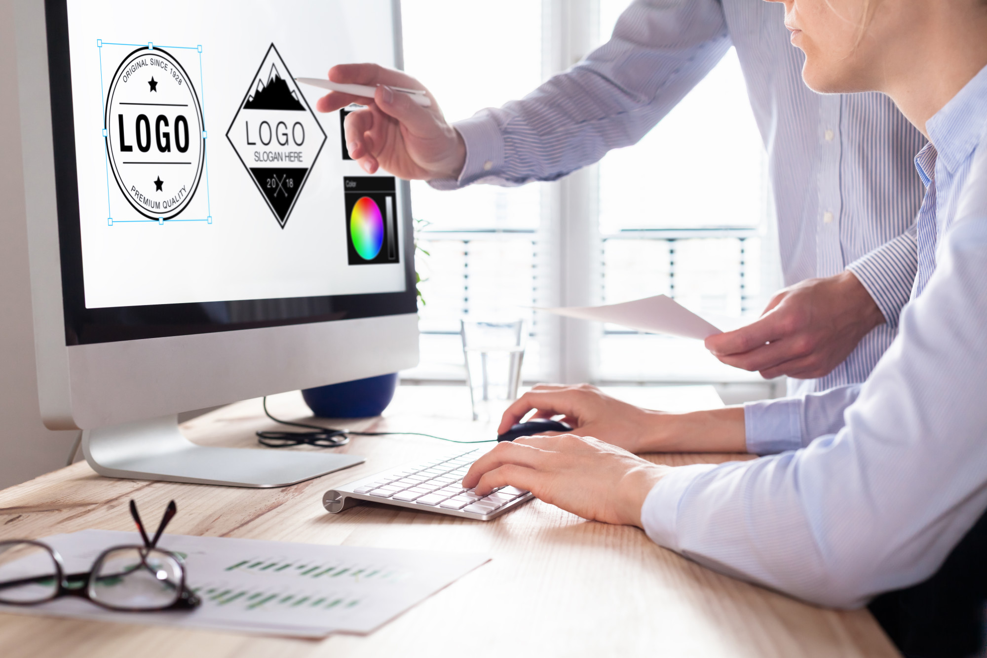
The company’s logo is an integral part of a business. It is advisable to choose colours that can complement the logo. There are few online tools available to suggest the best design and colour, depending on your logo. You should consider the colour wheel when choosing a shade which matches your logo. The colours should be from the same colour family or opposite sides of the wheel.

Everyone wants a logo that will help them or their business stand out from their competitors. It creates the first impression on your clients. Choose the right company for logo making, and they will choose the right colour and fonts. If you think that a monochrome theme will render the logo a professional touch, it’s high time you debunk the myth. Colours influence how we feel when we see a business logo.

Choosing A Colour For Your Logo Design? Consider The Points Stated Below

Colour Theory

Colour theory is used to create effective logos. Make sure you choose colours which complement each other. The colour theory is a bit complicated. So, you should choose an experienced logo maker in Banstead. They know the role colours play in conveying a message. If you want your logo to create an eye-catching and bold statement, choose orange, green and purple. Play with variations to know which colour scheme will work the best for your business.

Colour Psychology

Colours also determine human emotions and behaviors so colour psychology plays a very important role when creating a business logo. You should choose colour which can fulfill your business’s brand messaging. Choose yellow to convey warmth and optimism, orange reflects confidence and cheer, red is bold and youthful, and blue communicates strength and dependability. Know the colour psychology and apply it when creating the logo.

Font And Graphics

You don’t have to worry about the font and graphics of your business logo if you choose a reputable company to create it. Contrast is the key when choosing fonts and graphics. It is advisable to choose a light background colour and a contract colour for fonts and graphics. You can even use different shades of the same colour.

Get in touch with the experts at Media and More to create an effective business logo.

What Are The Major Qualities of a Reputed Marketing Agency?

Reputed-marketing-agency

What Are The Major Qualities of a Reputed Marketing Agency?

8 Pages With Full Responsive and CMS Site

Are you looking for a reputed marketing agency for your business? During your research for a marketing agency in Caterham, you will come across many small and medium-sized marketing companies offering different ranges of digital marketing and traditional marketing strategies. However, a good marketing agency can help promote your products and services positively and affordably to the target audience.

The size of a marketing agency doesn’t determine the capability of the people working in the same. Hence, while selecting the marketing agency for your business, ensure that you check the following qualities. Remember that a good marketing agency can promote your business and help you get financial profit, whereas poor marketing techniques will ruin your image beyond repair.

Top five qualities that a reputed marketing agency must have

Experienced and creative employees

The marketing agency you hire must have experienced employees in the team to help you with strategic marketing decisions. Startup marketing agencies generally have inexperienced marketing people in their team; however, there are companies among the startups where employees are highly creative in providing marketing strategies that can give you a competitive advantage.

Problem-solving skills

A good marketing agency must have effective problem-solving skills. If it cannot solve the marketing problems and suggest strategic marketing decisions, then the marketing agency is certainly not a good one.

Affordable marketing strategies

The marketing strategies offered by the marketing agency must be affordable. If not, it’s not a good decision to select the same. Affordable marketing solutions help to make profitable marketing decisions.

Positive reviews and testimonials

Check the portfolio and the expertise being offered by the marketing agency. Marketing agencies with impressive portfolios are the best ones. You must check the reviews, testimonials and portfolio of the marketing agency before hiring the same. If you get to see positive portfolios, it is certainly a good choice for you.

Define the range of expertise

Before hiring a reputed marketing agency in Caterham, make sure that the people working in the same must have good marketing knowledge and certifications to provide the job. Hiring people with expertise and knowledge is a sign of a good company. You must also check the number of people working for the agency. A good marketing agency needs a strong team of marketers.

Approach Media & More for excellent marketing strategies. We have a strong team of marketing strategists who follow a systematic approach to providing the best marketing solutions. To know more, check our website.

3 Benefits Of Outsourcing Web Design Services In Surrey

website design services

3 Benefits Of Outsourcing Web Design Services In Surrey

8 Pages With Full Responsive and CMS Site

Every company needs a workable website if you want the business to grow. In other words, developing a website is necessary for every business in this continuously evolving world of technology. Since designing a site for a company is quite complicated, it’s time you get in touch with a reputable company offering web design services in Surrey.

Most of them have years of industry presence and know how to prevent the process from becoming too time-consuming or stressful. Some even offer customised services so you can make the most out of website designing. They value their reputation and try to complete the task efficiently and on time. You need much planning even when designing a one-page website.

Planning To Outsource Web Design services In Surrey? Few Benefits You Can Reap

Web design service Surrey

Use Innovative Tools

Most web design companies value their reputation and use the latest technology and tools when designing a site. They use the latest UIUX trends and technology to update their skillsets. The objective is to outshine their peers in the competitive market. They might also share the latest web design trends. You have the flexibility to choose one according to your budget and business objectives.

Save Money

If you don’t want to waste a major portion of your resources on in-house web designers, you can consider hiring outsourced designers. You can cost-effectively complete the task. Some business owners feel that hiring local professionals for website designing will help them save some money. It is a myth you should debunk if you want to make the most of web design in Surrey. Designing a site needs a lot of experience and expertise, irrespective of the size of your project.

Choose From Numerous Designer

Most web designing companies have numerous web designers and developers working for them. Outsource your project to one of the companies and they will ensure that the best professional with experience in working on similar projects is given the responsibility. They will customise a website design plan that will suit your business objectives and budget. They are also aware of the common web designing mistakes and can avoid those.

Since you are now aware of all the benefits of outsourcing website designing services in Surrey, it’s time you get in touch with the experts at Media & More. A properly designed site will help you generate leads, establish a strong brand and move your business to the next level.

Different Types of Web Pages in An Effective Website

Types of Web Pages

Different Types of Web Pages in An Effective Website

8 Pages With Full Responsive and CMS Site

An effective website with relevant web pages and designs plays an important role in nurturing and helping a business grow leaps and bounds. Irrespective of the nature and size of the business, every business owner must develop website designs that will help highlight the business’s services and products effectively.

If you’ve lately started a new business, then make sure that you approach a professional web designer in Horsham to get your official website designed. There are quite a few relevant web pages that must be designed relevantly to get a functional and responsive business website.

To know more about the relevant web pages, read on. Here’s a list of the same.

5 different types of web pages must be present in a business-relevant website

Types of Web Pages

Informative Homepages

This is the website’s main page and acts as the face cover for your business. The home page helps the visitors get an idea of the products/ services your business offers. Since this is the first visible page, the brand’s name, logo, contact information, relevant pictures of the products, and the navigation buttons to the other pages must be presented perfectly on the homepage. A dull and non-informative homepage will not attract the visitors’ attention and reduce the conversion rate.

E-commerce web page

If you want to sell your products and services online, creating a robust e-commerce page is essential. This should be designed in a customer-friendly manner so that all the categories of products can be browsed well along with price and description. You can highlight discounts and sales on this page. Hire experienced web designers to get the best outcome for this page.

Blog page

This is a page on your website that will help the SEO experts increase your website’s Google ranking. You will be required to post informative blogs on this page. You can also post casual and informative content about your products and offers for your products on the blog page as well.

Portfolio/ products/service pages

This is one of the main pages that every website must have. It should highlight the major products, works or services that the business offers. In the case of a service-based business, the portfolio page must contain many works done by the company. Make sure that this page is visible to every visitor right after the homepage.

Contact pages

A directory or the contact page is the one that is generally present in the last table. However, this should be designed, and sufficient information must be provided to ensure that a customer can immediately contact the executives.


To get the best web design in Horsham, hire web designers from Media & More. Our web designers focus on creating personal and engaging websites for all businesses. Check our website for further details.

4 Reasons You Need A Responsive Website Design

4 Reasons You Need A Responsive Web Design In Horsham

4 Reasons You Need A Responsive Website Design

8 Pages With Full Responsive and CMS Site

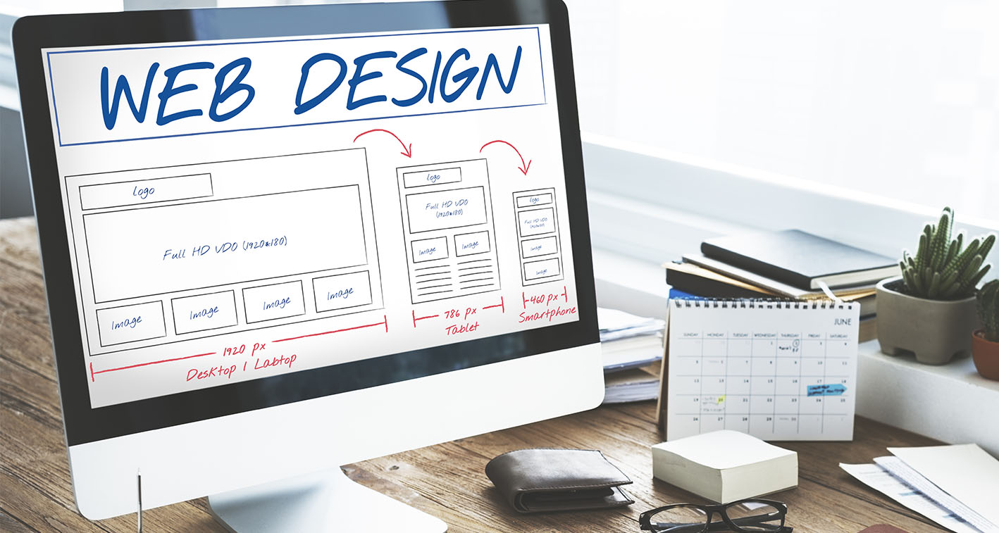
An easy way to make your website mobile-friendly is with a responsive design. The right design will solve many problems for your website. It will improve how your company’s website looks on various devices with different screen sizes. Your visitors will also spend more time on your website, which will help in improving your rank on search results.

Few More Reasons Your Website Needs A Responsive Design

4 Reasons You Need A Responsive Web Design In Horsham

More Mobile Traffic

You will be surprised to know that the top websites get the most traffic from mobile devices. It has become necessary for companies to have websites that their potential customers can view on the small screen without any distorted images. Instead of having a separate website version for mobile users, choose a responsive design, and your site will get better visibility at a lower price.

Fast Loading

Since mobile users generally have short attention spans, you need a website with a responsive design that loads faster. Get in touch with a reputable company for web design in Horsham, and they will create a responsive design for your site. You don’t have to worry about your potential visitors abandoning your web pages because they take more than 3 seconds to load. Online visitors can also become frustrated if the site is hard to navigate.

Less Maintenance

When compared with traditional web designs, a responsive design requires less maintenance, so you save a lot of time in the long run. You don’t have to invest in additional testing and support. To ensure the optimal layout of every screen, a responsive design uses standardised testing methodologies. You don’t have to maintain two content strategies, two design teams or two administrative interfaces.

Faster Mobile Development

You will have to pay for web design services and website development. Making a stand-alone mobile application is more time-consuming than making a responsive website. Time is money for business owners, and developing a responsive website will help them save a lot of time. You also have to invest less to develop a responsive website instead of developing two separate websites for computers and mobile.

Since you are aware of all the benefits of a responsive web design, it’s time you get in touch with the experienced designers at Media & More.

Webflow: Is This the New Beginning of Web Development?

webflow

Webflow: Is This the New Beginning of Web Development?

8 Pages With Full Responsive and CMS Site

The world of web development and designs witnesses transformations every day. Some of them fade away after a while, and some come to rule the industry. The current buzz in the market is Webflow, and it seems that it will be not go anywhere soon.

With so many challenging and complex procedures of web development and designing, experts have been trying to get something easy and quick for many years. Coding seems the most difficult part of this job, and now it can be easier and quicker with this latest technology called webflow.

Webflow - Beginning the New Era of Web Development

Webflow new era of Web Development

What Is Webflow?

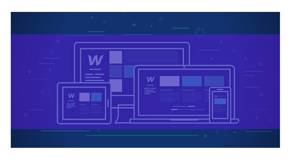
Webflow is the latest web design and development tool. You can also call it CMS, an ecommerce and hosting platform. A particular feature or product set represents each aspect of this platform so that users can easily understand and pick the feature as per their needs.

Ensure Clear Navigation

You can capture the interest of your audience and improve dwell time by designing a site that can be easily navigated. Get in touch with a reputable company offering web design services and they will choose a design for clear and concise navigation. You can also expect longer bounce rates if your site offers easy navigation. Your audience won’t feel frustrated if they don’t have to spend more time to dig the information they need.

Why Should You Choose Webflow?

Typically, web designers and developers use different types of tools to execute different types of jobs that include graphics and visual design, coding, prototyping and others. The use of so many complex tools makes the process of web design and development challenging, time-consuming and sometimes daunting for professionals.

The main aim of webflow is to simplify this entire process of web designing by allowing you to design and develop at the same time. This will save you time, give you flexibility and ensure smart results.

Some of the Typical Issues that Web Designers Face

  • Find it is hard to keep the connection between the visual design and the coding.
  • Find it challenging to code animated transitions because of the complexity of these interactions.
  • Creating and optimising designs for different types of screens to support the responsive format of the website.

How Can Webflow Help the Designers in this Journey?

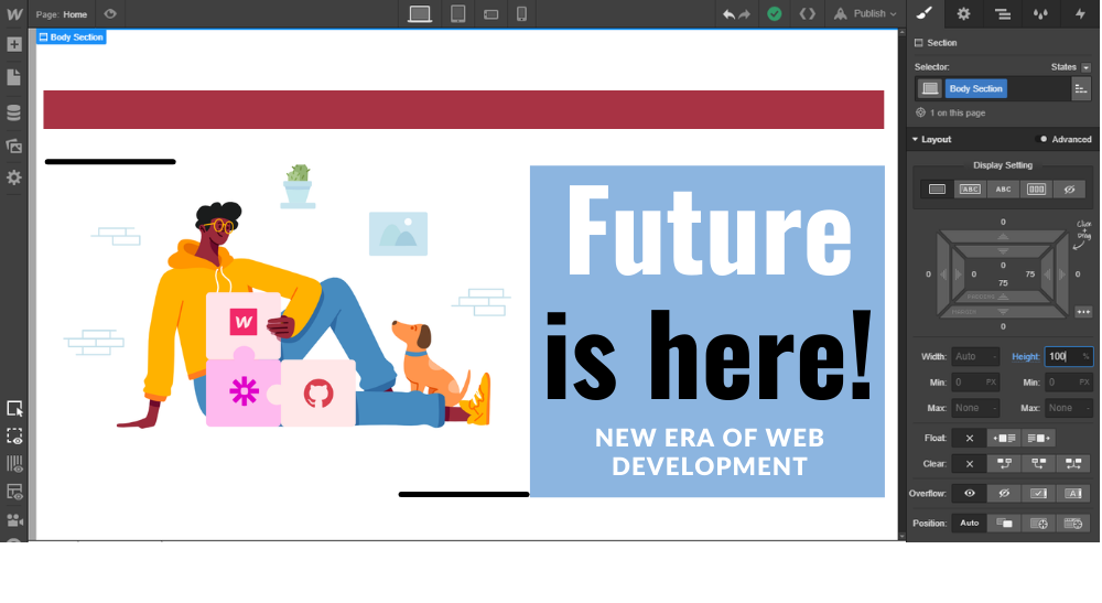
Webflow, being an in-browser designer tool, allows web designers to design, develop and launch visually responsive websites. This is an all-in-one designing platform that helps designers to perform the entire task flawlessly that including mapping the initial ideas to delivering a ready-to-use product for their clients.

How is Webflow Different from Other Design Tools?

  • Here, you do not see the codes and the visual designs separately.
  • Everything you create in the visual editor is powered by JavaScript, HTML and CSS.
  • Webflow allows web designers and developers to reuse CSS classes.
  • It is a platform that offers hosting plans through which you can connect a custom domain and keep hosting your HTML site.

What is the difference between WordPress and Workflow?

WordPress is an open-source content management system or CMS. You have to install this CMS on your hosting server. Webflow is a “Software as a Service” or SaaS application that will manage everything for you.

Get the Best Website Design and Development Service

When you are looking for a smart, easy and efficient service of web design and development, you must trust the experts of this industry. Media & More is one such company. We have vast experience working with the latest applications to create smart and functional websites with mesmerizing designs.

Please get in touch with us for latest updates.

Increase Dwell Time On Your Website With 4 Web Designing Tips

website desgn

Increase Dwell Time On Your Website With 4 Web Designing Tips

8 Pages With Full Responsive and CMS Site

Every business owner knows the importance of dwell time. Generally, it refers to the amount of time a person spends on a website after clicking a link on the SERP page and before going back to the search results. You need a web design that will increase the dwell time so that users can find what they need. If the dwell time is long, search engines will assume that your site can be trusted. As a result, your rankings will improve and you will get better placement on search results.

Few Ways You Can Improve Dwell Time On Your Site

Pro Tips Website Design hacks to increase Dwell time

Produce Quality Content

The quality of the content you are providing on your site will determine how much time people will spend there. They will spend more time if the content is valuable. It is your responsibility to ensure that the content you are providing is informative, helpful and engaging. Try to avoid writing promotional content as they are quite dull. You can engage your audience with compelling and entertaining content. If possible, use more videos, photos, quizzes, infographics and compilations.

Ensure Clear Navigation

You can capture the interest of your audience and improve dwell time by designing a site that can be easily navigated. Get in touch with a reputable company offering web design services and they will choose a design for clear and concise navigation. You can also expect longer bounce rates if your site offers easy navigation. Your audience won’t feel frustrated if they don’t have to spend more time to dig the information they need.

Use Videos And Images

There are a few situations when people don’t read content, even if it is of high quality. It generally occurs if the content is too long and does not have breaks. It becomes a challenge for readers to maintain their attention. You can increase the value of your blog post by adding a few images and videos where possible. It also helps in improving the dwell time by captivating your readers.

Optimise Loading Speed

In today’s hectic life, people lack the patience to wait when a site is loading. There is a high chance for them to leave if it takes more than 2 seconds to load. The loading time of a website largely depends on its design. Choose skilled designers as they know the various factors that impact the site load time’s consistency and speed.

Since you now know the various ways the web design can increase the dwell time on your website, it’s time you get in touch with the experts at Media & More.