Top Three Signs Your E-commerce Site Needs Redesigning

responsive-website-design

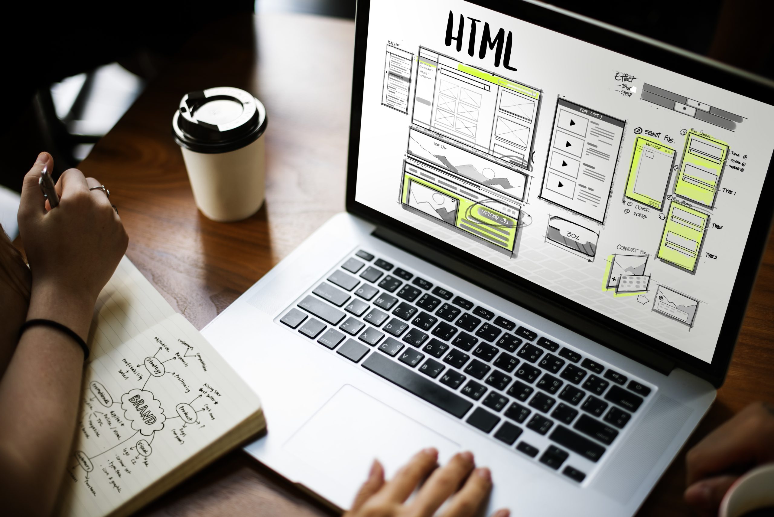
The design of your e-commerce website can significantly influence your sales and customer experience. A website design should be user-friendly that is also modern and attractive. A website that has not been updated for a long time can lead to poor functionality. With an updated design, your advertising efforts will be successful.

But how can you understand when your website properly serves your clients or needs updating? There are a few aspects that you must notice to analyse your site, and it all comes down to how clients are now treating your site. This is called user experience, and it’s key for your website designer in Coulsdon to make it count when finding ways to increase your online sales. Here are the signs that your e-commerce site is in need of some web design.

When Your Website Is in Need of Some Design?


Your site is difficult to use

A website design’s most crucial advantage is its user experience. An e-commerce website should be user-friendly so customers can easily find what they need. They will leave your site immediately if they can’t find the product they want quickly. However, this can be fixed with an efficient website design. Consider your prospective clients and see whether they can find the needful quickly.

Your search engine rankings are subpar

When it comes to boosting search engine rankings, website design plays a critical role. For search results pages, Google doesn’t only verify the written content. UX plays a significant role in your site ranking as well. Also, your site needs the implementation of an effective SEO strategy. SEO raises your website’s visibility in search engine results pages (SERPs), boosting website traffic and sales.

Your site is extremely slow

The first problem with a slow website is that users may lose interest and leave it out of frustration. This implies that if the website is not speed-optimised, potential customers can leave. Furthermore, a lot of search engines penalise websites with sluggish load times by placing them lower on their search engine results pages (SERPs). This restricts access to potential clients and further lowers visibility. Your website redesign should focus on making it faster and more user-friendly for customers.


If you are searching for an experienced and competent ecommerce website designer in Coulsdon, look no further than Media & More Ltd. Our expert team of web designers can deliver a website that looks excellent, is user-friendly and can help you generate more sales. To know more, get in touch with us today.



Common Mistakes You Must Avoid When Designing a Website

website design services

Designing a website needs an individual to be creative. Understanding the project’s scope is important before you start working on a website or designing a new one. You can hire an expert for the best website design services. Here are some of the common mistakes in website design.

Avoid These Designing Mistakes To Develop a User-friendly Website

Overloading

Using various types of fonts, incompatible colour palettes, scattered images, and other elements can overload a website. Try to stick to a single style and avoid choosing more than two or three colours wherever possible. 

Poor Structure

Messy pages are one of the biggest mistakes when designing a site. This includes a curved layout, a jumble of blocks with content, inconvenient navigation, button inaccessibility, and other important elements. Hence, designing a site that makes its visitor understand the entire structure is vital. You can also create a map if a site is complicated. 

Pop-ups

Well-designed pop-ups can indeed benefit your business. But frequent pop-ups can irritate users. Avoid overlapping the content and use reasonable-sized banners. It will help users to gather the required information. 

Poor Quality Linking & Inappropriate Images

Links that are not clearly visible to the users can annoy them. Ensure using high-quality links and images on your site. Besides, also make sure that those links are relevant and do not confuse visitors or divert their focus. 

Infinite Page Scrolling

This can be ideal for engaging users to explore everything about a site in-depth. Scrolling is also ideal for mobile devices. But it also doesn’t always display accurate data. Hence, ensure to use the scroll while attaching materials to the top. It will give users enough information without downloading all the pages.

Slow Loading

This can have a negative impact on the visitors of a site. Problems while loading a page are the main reason many sites remain abandoned. You can optimise the image size to reduce download speed. Besides, web-based tools can also provide insight into your site and improve the download speed. 

Lack of Optimisation for Search Engines

Just completing a web-design course isn’t enough to create an impactful website. Ensure using unique texts on the site on all the pages. 

Media & More is a leading company providing quality services for website design in Horsham. Contact us today to learn more about our services. 


Why Maintaining Visual Hierarchy Is Important In Web Design?

website desgn

Visiting a website and not finding what you are looking at indicates a poor visual hierarchy. Positioning is important to boost your website performance. You can hire experts for impactful website design in Surrey. Here’sHere’s what you should know about the visual hierarchy.

Importance of Visual Hierarchy

To understand the significance of visual hierarchy, first, you should know what it is.

What is Visual Hierarchy?

It is the principle of arranging elements in the relevant order, considering their importance on a page. On average, a person will spend nearly 8 seconds to ascertain whether it’sit’s relevant. From menu and logo positioning to placing buttons and icons, everything must be arranged in a pleasing way to facilitate the audience.

What are the principles of Visual Hierarchy?

Seven principles of the visual hierarchy include:

  1. Position
  2. Size
  3. Colour
  4. Alignment
  5. Contrast
  6. Proximity
  7. Typography

Content must be easy to find and logically structured to provide a positive user experience. Let’sLet’s learn these principles in detail below.

  1. Positioning

Most humans generally read left to right and start from the top. Generally, the human eye follows two patterns to quickly absorb information, whether it’s a website, illustration or something else. These two usual paths are Z-shaped and F-shaped.

Z-Pattern: With this pattern, the user first scans horizontally throughout the page where there is vital information and then moves diagonally towards the lower section of the page.

F-Pattern: This pattern is typically applied for reading text on heavier pages. With the F-pattern, the user typically starts reading the headlines first and moves down the page’s left side looking for important headers, bullet points or numbers.

  1. Size

Size also plays another important role, representing a sense of hierarchy. It helps search sections and build an organisation within the image or text the user looks at. The best example is an offer or deal’s terms and conditions section. They are significantly small in size as companies don’t want to draw customers’ attention to them.

  1. Colour

We can assume the colours psychology in the visual hierarchy to encourage our users to act in a certain way. You can use visual hierarchy to stir up the action with:

Use contrasting colours for contrasting themes across the content.

Save the eye-catching colour from your brand’s palette for calls to action and buttons.

Keep important information in the same colour throughout the content.

  1. Contrast

This strategy is best seen in magazines. Use assets and colours contrasting to your brand to signpost essential information to users.

  1. Alignment

It’sIt’s essential to keep your content digestible. For example, Format important information with a central alignment rather than a left-handed one.

  1. Proximity

Using proximity and space is crucial in separating content or bringing it together, whether it’s a minimalist, single page or flat website design.

  1. Typography

The right pairing of typefaces can provide a website with its uniqueness.

Media & More provides the best services for web design in Surrey. Contact us today or check our website for more information.


4 Important Things to Consider While Ordering Branded Workwear

Branded Workwear
black23

4 Important Things to Consider While Ordering Branded Workwear

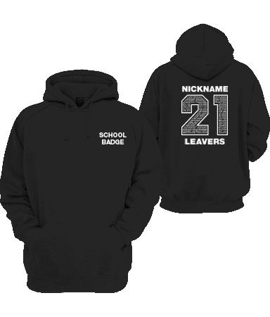
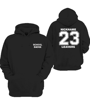
Are you thinking of purchasing branded workwear for the employees of your company? It is unquestionably a good prospect. Branded workwear helps to promote the company positively. When an employee wears a dress with the company logo on it, it surely shows the level of commitment and attachment that the company has to the employees. However, before you decide to buy branded workwear in Coulsdon, make sure that you keep a few points in mind.

What are the important things to consider while ordering branded workwear?

Type of branded workwear

You must clearly envision the type of workwear you want for your company. More than merely putting a logo is required. The workwear you’re selecting must align with the goals and vision of the company. Moreover, remember the comfort level of the employees wearing the branded dresses. If the employees are uncomfortable, they will not wear the same.

Design of branded workwear

Once you’ve decided on the types of workwear you want, check the designs that suit your personality. You must also consider colour and design while selecting branded workwear. Focus on selecting a neutral colour. Companies often prefer embroidering the logo on T-shirts. You can also get the same printed if you feel like it.

Cut, measurements and fittings

Remember that men and women will wear the same whenever you choose branded workwear. Make sure you go for unisex cuts and keep a standard measurement when selecting the dress materials. Polo or formal shirts are generally unisex in cuts and measurements. Selecting them will be a practical option.

The material used in branded workwear

Consider the fabric choices when opting for branded workwear. You’ll often find employees complaining about the poor quality of fabrics used for branded workwear. Opt for a piece of good quality fabric to satisfy the organisation’s employees. You can choose cotton which everyone likes wearing.

You may need a multi-coloured logo printed on the workwear or a single-coloured logo embroidered. The choice depends on the affordability of the company as well.

For quality design for your branded workwear in Coulsdon, approach Media and More. We supply good quality and visually prominent workwear for your employees. To know more, check our website.

5 Points to Consider When Designing a Logo For a Website

logo-design

5 Points to Consider When Designing a Logo For a Website

8 Pages With Full Responsive and CMS Site

Designing a logo for a website can be challenging, but it’s also one of the most important decisions you’ll make for your brand. A logo is the first visual representation of the brand in the eyes of the customers. Your business logo is what you do and what your mission is. Hence, it must be eye-catching and impressive. Hire professional logo makers in Coulsdon to get the best logo designed properly.

Here are five points to consider when designing a logo for your website.

How to design a logo for the website?

Simplicity

A simple logo is easy to remember and versatile, making it more likely to be recognized and remembered. Aim for a clean, uncluttered design with straightforward typography and an uncomplicated graphic element.

Relevance

The logo should be relevant to the products or services offered by your website. Consider the industry you’re in and what kind of message you want to convey through your logo. If the logo is not relevant according to the needs of the business, then the customers will not be able to connect with the brand.

Brand Identity

The logo should represent the brand and convey its values, personality, and tone of voice. It should be memorable, meaningful, and distinctive. Hence, ask the logo maker to study the business’s mission, vision and core values before designing the logo.

Versatility

The logo should be flexible enough to be used in various contexts, from website headers to business cards. It should work in black and white, as well as colour, and be easily scalable.

Trends

While creating a timeless logo is important, it’s also important to stay current with design trends. Pay attention to design elements that are popular in your industry, but also be mindful of trends that may become dated quickly.

Remember, your logo is often the first thing people will see when they visit your website, so it’s important to get it right. Take the time to consider these five points, and work with a professional designer to ensure that your logo effectively represents your brand and communicates your message.

Media & More is a renowned name for website design and development services. For the best logo makers in Coulsdon, approach us. We’ve created logos for a diverse range of business clients. Whether you want a vintage, modern or futuristic logo for your website design – we have a proficient team who can handle the same effectively.

To know more, check our website.

The Role of Colours in Web Design: How to Make Your Website More Appealing

web design horley

The Role of Colours in Web Design: How to Make Your Website More Appealing

8 Pages With Full Responsive and CMS Site

Colour plays a pivotal role in web design, as it is integral to how people interact with websites. Colour not only helps create a visual aesthetic but also serves as a way to provide information, guide the eye and evoke emotions from the user. It can influence mood, create a sense of harmony or even provide clarity and purpose on a website.

Therefore, the use of colour must be considered carefully when designing websites to ensure that the best possible user experience is achieved.

Create the Focal Point for the Users

One way to effectively use colours is to create a focal point for users on a website. Primary colours such as red, yellow and blue are often used to draw attention to certain important elements within a page. In contrast, other secondary or tertiary colours will be used to complement these elements.

With a strategic selection of different hues and shades, designers can create certain visual effects, such as contrast or depth, which help guide visitors around the page and encourage them to take action.

Convey Brand Identity in Style

Colours are also important when conveying brand identity through website design. Companies often use their own brand colours throughout their site to maintain consistency across various pages and reinforce the brand’s message.
For example, McDonald’s uses its iconic golden arches throughout its website, while Apple adopts its signature black and white logo designs, which have become synonymous with its products.

Affect User Behaviour

Colours can also affect user behaviour when browsing websites too. Studies have shown that warmer tones (such as reds and oranges) raise customer excitement levels more than cooler ones (such as blues). This means that designers should consider what type of emotion they want users to feel when visiting their site—whether it’s calming, inviting or energising—and then choose the appropriate colour palette accordingly.

Similarly, bright saturated colours tend to increase engagement levels more than muted tones; therefore, if higher participation rates are desired, then brighter colour schemes may be employed instead.

Follow the WCAG 2 AA Guidelines

Finally, colour accessibility should always be taken into consideration during web design projects – particularly given recent changes in regulations such as WCAG 2 AA guidelines regarding web accessibility for disabled users. Creating template designs with high contrast ratios between text and background colours is essential for improved legibility for those with impaired vision or colour blindness.

At Media & More, we keep all these factors in mind while selecting the colour pallet for a website design project. Please get in touch with our experts to know in detail about our process and techniques.

Web Design Practices For Smart Navigation

A website with functional and smart navigation always makes visitors happy. You should create an organised and efficient navigation bar that can direct your viewers to the right way as per their requirements. They would love to explore more about your products or services while visiting your website. A functional navigation bar will make their job easy and fast. The navigation bar must have accurate and clear headings that can state information directly. You can also add subcategories under one navigation bar to make browsing easier for your viewers.

Most Effective Web Design Practices: Features Your Visitors Cannot Ignore

Web Design Practices

Most Effective Web Design Practices: Features Your Visitors Cannot Ignore

8 Pages With Full Responsive and CMS Site

A good website will help your business to stay in the competition for a more extended period. Nonetheless, creating a website that will help you attract traffic and offer a great conversion rate is not easy. There are lots of web design practices that determine the success of a website.

As a business owner, you should know the best web design practice to enjoy the desired ROI. You need to focus on features that will not make your customers confused and, at the same time, will help you to achieve your goals.

Best Web Design Practices

Web Design

Strong Branding

From the logo of your company to the image you use on your website, every single segment should be designed and developed as a part of your business branding. Your website must reflect the type of product or service you offer to your customers. For a company providing minimalist and smart products, the logo, image or headline of the website should be sleek, elegant and practical.

Web Design Practices For Effective CTA

Your website mainly aims to attract viewers, give them information about your products or services, and convert a casual viewer into a strong customer. The role of an effective and robust CTA or Call to Action button is imperative in motivating your viewers to perform an action to go the next levels one after another. This CTA must be positioned in a place that can be easily visible, clear and effective. The objective is to entice your audiences to perform a specific action (Call, send an email or buy products) to increase the conversion rate. The CTA buttons must look unique, alluring and intriguing so that buyers can easily notice and press them.

Fast Loading of Pages

Websites with slow loading time can ruin your online reputation. Visitors feel disgusted to stay on a site that takes too much time to load. To prevent the bounce rate of your website, you need to improve the loading time of your website pages and ensure that your viewers can enjoy a fast service. Use necessary plugins, smaller images, optimise your content – these are few tricks to increase the loading speed of your website. If you already have a website that has a slow loading speed, you can contact web design experts. They will add new features and rectify the existing ones to change the situation.

White Space

Our mind absorbs visual content more rapidly than what it hears. Both written and graphics or images can be absorbed by our mind, which sometimes makes it confused. The presence of too much content on a website can make the page look crowded and confusing. To avoid this issue, you must have adequate white space on your web pages. This white space might refresh your mind and eyes. An experienced and knowledgeable web designer will use this white space carefully and effectively.

Web Design Practices For Smart Navigation

A website with functional and smart navigation always makes visitors happy. You should create an organised and efficient navigation bar that can direct your viewers to the right way as per their requirements. They would love to explore more about your products or services while visiting your website. A functional navigation bar will make their job easy and fast. The navigation bar must have accurate and clear headings that can state information directly. You can also add subcategories under one navigation bar to make browsing easier for your viewers.

Responsive and SEO-Friendly

Nowadays, no one can imagine a website without these two features. A responsive or mobile-friendly website can attract 50% more traffic and earn at least 70% more ROI than a traditional one. On the other hand, being SEO-friendly means you can obtain a higher ranking on SERP, which will make your online presence more potent than ever. Web designers always try to build SEO-friendly responsive websites that are highly profitable for your business.

Media & More offers smart and effective web design solutions in Redhill to match your business needs. Please get in touch with our experts at 01737 400061 for more information.

Responsive Web Design: Why You Need It for Your Business

Web Design

Responsive Web Design: Why You Need It for Your Business

8 Pages With Full Responsive and CMS Site

This is 2021, and if you still think that a responsive web design is an overrated technical feature, you must reconsider your thoughts about this. Responsive web design is no more a luxury for businesses all over the world. This idea has been dominating the industry of website design for quite a few years.

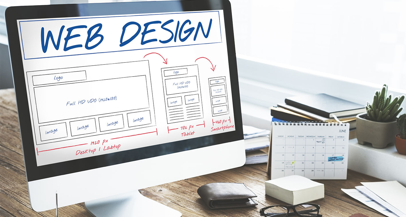
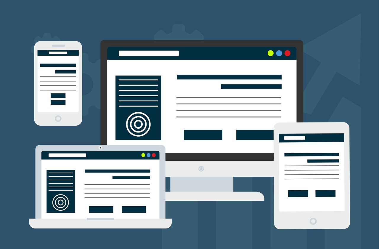
As an efficient technique of transforming a business’s online presence, responsive web design is completely reliable. A website with this designing feature can be easily browsed, navigated, and used on mobile platforms.

Benefits of Responsive Web Design

Web Design

Make Your Website More Useful

A website with responsive design can be useful, smart, result-driven and customer-centric in all possible manners. Hence, you can expect to have more traffic and a greater conversion rate with such a website for your business. You can use the maximum potential of your website when you prepare it for all kinds of smart devices irrespective of their screen size and purpose.

Responsive Web Design Something for Future

After witnessing the latest improvement in the technology of the mobile phone, it would not be an exaggeration if we say that tomorrow’s world will become completely mobile device-centric. From laptops to Smartphones or Smartwatches – every mobile device will rule our future. Upcoming technological development will help them to become the major controller of our everyday actions. Hence, the idea of investing in responsive website design will help you to prepare your business for the future.

Offer Better Use Experience

Every business aims to make their clients happy with their services. After all, you design and develop websites for humans. The more flexible a website can be, the more viewers it can attract. The technique of responsive design makes your site flexible and easy to browse on various devices, including laptop, desktop, iPad, Smartphones, tablets, and others. That means your users can visit your website to order products, collect information or contact your team from any of these platforms at any time they want. This flexibility will really help your business to grow, and your brand will become popular soon.

Better Connectivity With Responsive Web Design

The growth of your business can be possible when you stay connected to your customers. People love to deal with brands that are responsive and alert. The mobile version of your website allows them to get in touch with your team 24×7. You can offer your clients a flawless customer support service to fulfil all their requirements. This would give your brand a strong position in the industry.

Important for Ranking Factors

Websites that have responsive designs can obtain a faster ranking on SERP. Sites with responsive design usually load faster than other websites. This feature boosts their ranking automatically. You can enjoy a significantly low bounce rate and enjoy a more reliable rate of conversion. With a higher ranking, your website will achieve higher traffic and better ROI.

Smoother SEO Techniques

With a mobile-friendly website, you can easily implement the latest SEO techniques to grab the attention of your target viewers. Since responsive web design allows you to have only one website to maintain, you can plan your SEO strategies with the utmost care and achieve success easily.

Media & More is a well-known company delivering high-end solutions for modern businesses. We have a specially trained team for responsive website design services in Dorking. Please get in touch with us at 01737 400061 if you wish to reap the benefits of this technique.

Tips to Improve the Performance of Your Website including Branding and UX

Branding and UX

Tips to Improve the Performance of Your Website including Branding and UX

8 Pages With Full Responsive and CMS Site

Lockdown and pandemic bring enormous challenges for industries all over the world. Now that the UK is experiencing a bit ease in the current lockdown condition, companies are taking higher initiative to overcome this crisis and achieve the strongest position as soon as possible. While building new strategies for their business, most of the UK companies are focusing on improving their website’s design, branding and UX.

Since these three are highly significant factors in making a business strong in industry; they need expert help and dedicated service.

How to Makes Changes in Present Business after Lockdown

There are certain things that you need to consider while looking for such improvement. Know them and apply the right techniques with the help of the experts of website design and development.

Check the Strength of Your Website’s Branding and UX

A website with a robust and unique user experience will always win the race. On the other hand, no matter how stylish your website looks or how smart the content is; if the UX is poor, it will not provide you with the desired results.

To be on the safer side, you should constantly review your UX and try to upgrade the same as per the latest trends of using websites by consumers. The UX must be changed and evolved to fulfil the transforming needs of your users and make them happy.

Record the common obstacles and keep changing the platform to reduce the same. Set analytical reports to check the current state of UX and plan improvements accordingly to achieve goals faster. These analytics can be used to determine your traffic’s demography, target audiences and their changing browsing patterns too.

You can get a clear idea about which products are selling better and which pages are getting higher traffic through these reports.

Inspect if the Branding and UX is Up to Date and Consistent

With time, your brand should be updated and consistent in the market. This will help your customers to notice your brand everywhere every time. The process is required to improve visibility as well as the strength of the brand itself. You need to review your branding strategies constantly and upgrade the same at a regular interval to make your effort result-driven.

Set your goals and understand the needs of your target audiences. Right branding strategies demand patience, intellect and the capacity of taking decisions based on reviews you have on your hand. The changes you are about to make should be relevant to your business goals.

You must be aware of the shortcomings of your brand and try to overcome the same with fresh and smart strategies. Employ reliable and trained designers to get something highly desirable, unique and customer-centric. From the colour of your logo to the font used on your web pages – everything must be a part of your branding strategy.

Check Your Website’s Design

You can never earn a great position in the market with a faulty or average website design. In this present state of lockdown, this has become even more challenging than ever. Business houses are looking for new design ideas to make their website more stunning and eye-catchy than ever. A practical design system will hold all the key documents of your brand so that you can easily access the same.

Lockdown gave you enough time to look inward and find out the scopes of improvement in the design system. Spend time to have a look at your website pages from a user’s point of view to find out design drawbacks and plan the improvement accordingly. Ensure that your design and marketing team work hand in hand to provide you with the best results.

At Media and More, we offer comprehensive services to our clients regarding their UX, website design and branding needs. For details, kindly get in touch with us at 01737 400061 for more information.

Risky website redesign mistakes that can ruin your seo strategies

Risky website redesign mistakes that can ruin your seo strategies

8 Pages With Full Responsive and CMS Site
website redesign is essential, but that should not put your SEO strategies on high risks. Sometimes, the companies make website redesign mistakes that can cripple their SEO strategies. Before you hire a professional and well-established web designing company for redesigning your website, you need to be sure about a few matters.

Why website redesign necessary?

There are several reasons why a company should go for website redesigning project. Modification of your existing website can make your brand promotion easier and better. Along with the cause, you need to determine when and how the redesigning of the website should be done.

Things to consider for website redesign

Website redesign mistakes you must avoid

Not-optimising the on-page elements

Never forget to optimise the on-page elements of your website while redesigning the same. Non-optimising these elements will keep your renovated website far behind in the list of relevant sites on the SERPs.

Not using SEO-friendly contents

After redesigning the website, it is necessary to add SEO-friendly contents on the same. Whether you are keeping the same content or adding something new; must use relevant keywords and add SEO-friendly elements to the content to make it visible and trendy.

Forgetting about mobile users

Never forget your mobile users. You should always ask for a responsive web design while hiring a team for redesigning your website. The average consumers now spend at least 75% of their time in a day on their mobile phones doing several types of work. The more you can utilise this time, the better conversion rate you can obtain.

Ignore page loading times

No matter how improved or alluring your new website looks, it must not have a long loading time. The lower the loading time, the better user-experience you can offer. Hence, it is necessary to improve the loading time while redesigning the pages. At Media and More, we offer brilliant website redesigning solutions to our clients. No matter what industry you belong, we can offer you smart and relevant web designs to match your requirements and goals. Please get in touch with us 01737 400061 for more information.